
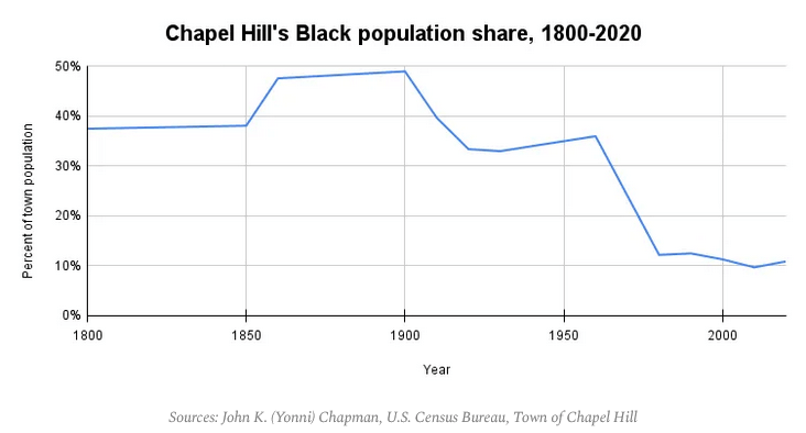
Two facts have been swirling in my head since I first heard them: that Chapel Hill’s Black population share plummeted between 1960 and 1980, and there’s been a 32 percent decrease in Black homeownership in Chapel Hill since 2010.
Mike Ogle’s Stonewalls blog traces Chapel Hill’s Black population decline, using John K. (Yonni) Chapman’s dissertation as the basis for much of his research. The 32 percent figure comes from an analysis prepared last year for Town Council.
Armed with this information, I contacted Mark Chilton, the Orange County Register of Deeds, in January. Chilton, who previously served on the Chapel Hill Town Council and as the mayor of Carrboro, is also one of our area’s most knowledgeable historians. He has digitized and maintains several collections on Orange County’s history of slavery, wills, deeds, and slave transactions.
Using maps to tell the story
I told Mark that we were interested in tracing how land ownership across Chapel Hill, Carrboro, and the areas just outside of our towns have changed over the past century, particularly since 1960. I was most interested in areas that we know had a large Black population in the first half of the last century, and now don’t.
Mark encouraged me to narrow the initial project focus, and then expand after preliminary data came in. So we started much smaller – with one block in Northside – which historically housed the largest Black population in Chapel Hill.
Mapping landownership in Northside in the present
We wanted to see how home ownership patterns have changed over time. We focused on Northside initially for a few reasons:
1. We know the population has rapidly changed in Northside. The U.S. Census found 1,159 black residents lived in the neighborhood in 1980. By 2010, there were 690. (That’s data collected by the Town of Chapel Hill.)
2. Mark used to work for EmPOWERment Inc. and knows many of the people who live in Northside. Coupled with the birth and marital records he has access to at the register of deeds, this would be the quickest way to develop a proof of concept.
3. Northside established a Neighborhood Conservation District in 2004, which encouraged development similar to what already existed in the neighborhood. Other initiatives, like the Northside Housing Market Action Plan (2013) and the Northside Neighborhood Initiative (2015-present) have worked to develop affordable multi-generational housing. We were curious if we could see (over time) how these initiatives have affected home ownership.
We then contacted Orange County GIS and got shape files for the houses in Northside. That allowed us to make these figures.
And then Mark looked at a block in Northside today. Here it is:
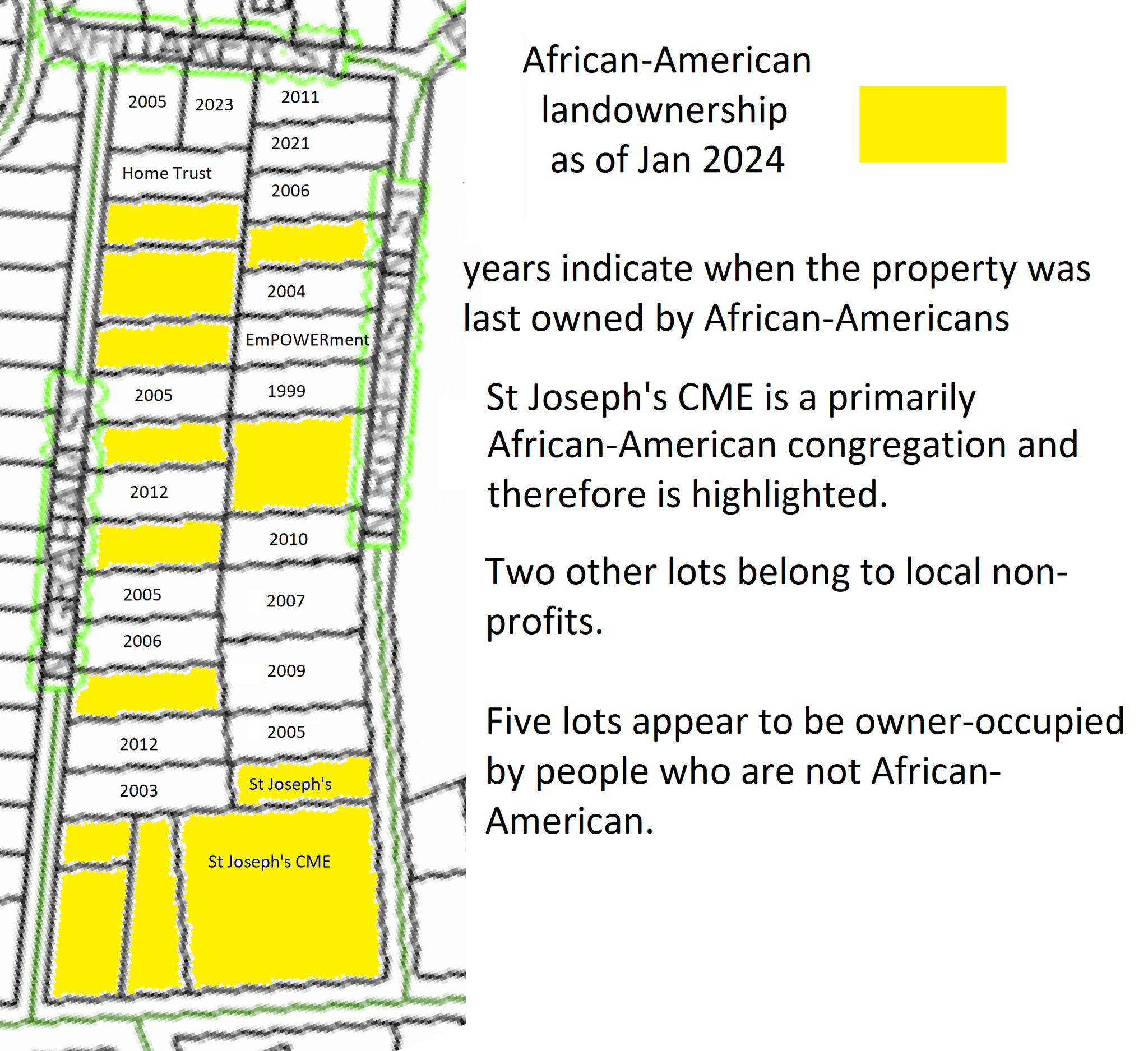
A couple of notes: This is obviously an image, and not a CSV, so it’s not accessible for screen readers. That data will be coming. And this data doesn’t differentiate lots that are owned by non-profits, like the Community Home Trust. That will be forthcoming too.
But it does show (in yellow) the properties that are currently owned by a Black person and in white, the last year when the lot was owned by a Black person. It’s quite revealing, even with one block. Most notable is that several of the properties on the block are owned by real estate investors who own lots of student rentals in the neighborhood. The Jackson Research Center at the Marian Cheek Jackson Center has traced the rise of investor-owned properties in the neighborhood using Orange County Land Records.
Expanding beyond one block
For the first time since the 1980s, Northside has seen a small increase in Black residents since 2015.
But that change hasn’t reversed a long-term trend.
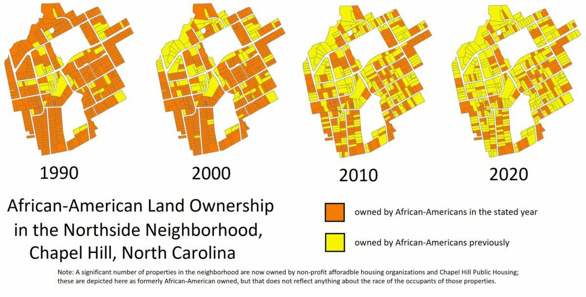
The image below, which traces homeownership patterns over time, quantifies the stark changes that have taken place in this one neighborhood over the past 30 years.
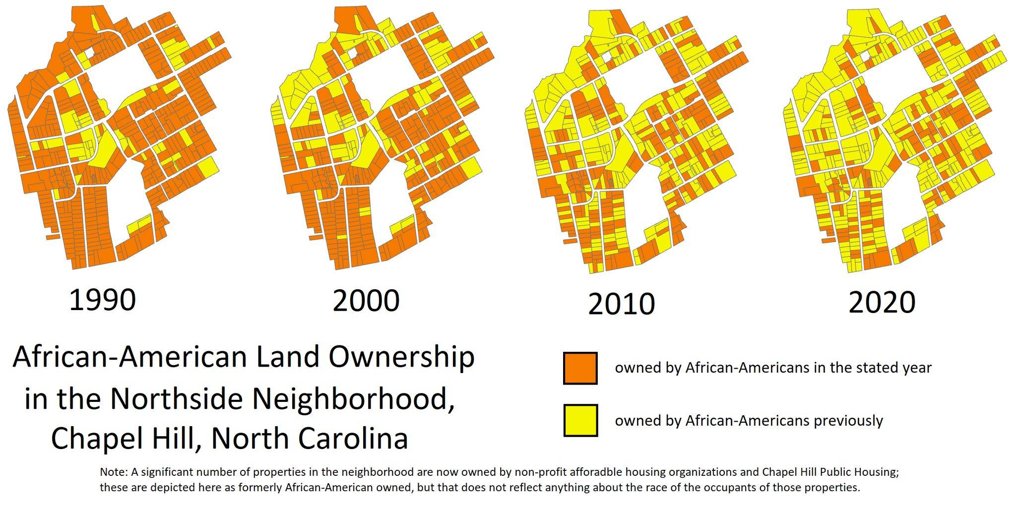
Again a few caveats: this map does not show properties owned by non-profit affordable housing organizations or the Town of Chapel Hill. (That’s coming.) It only shows home owners, not renters. (And it doesn’t include individual units in a condo building.) It also is more difficult to obtain data on out-of-state residents and LLCs, so best efforts were made and will be refined over time. The data is static, not in a CSV, so we can’t add context like the year Northside became an NCD, which properties are owner-occupied, and which are owned by investors. (That’s also coming! Stay tuned!)
But as soon as Mark posted this proof-of-concept image to Facebook, it was evident that we should continue this work, and expand upon it. Because this image starkly shows how Northside has changed – and how many people care about these changes. Comments poured in from people who realize the importance of this work, and want to better understand how these structural changes came about.
What we want to do next and why we need your help
1. Mark is putting all of this initial data into a spreadsheet. That allows us to use mapping programs and computer code to create interactive maps with this data, and add additional context.
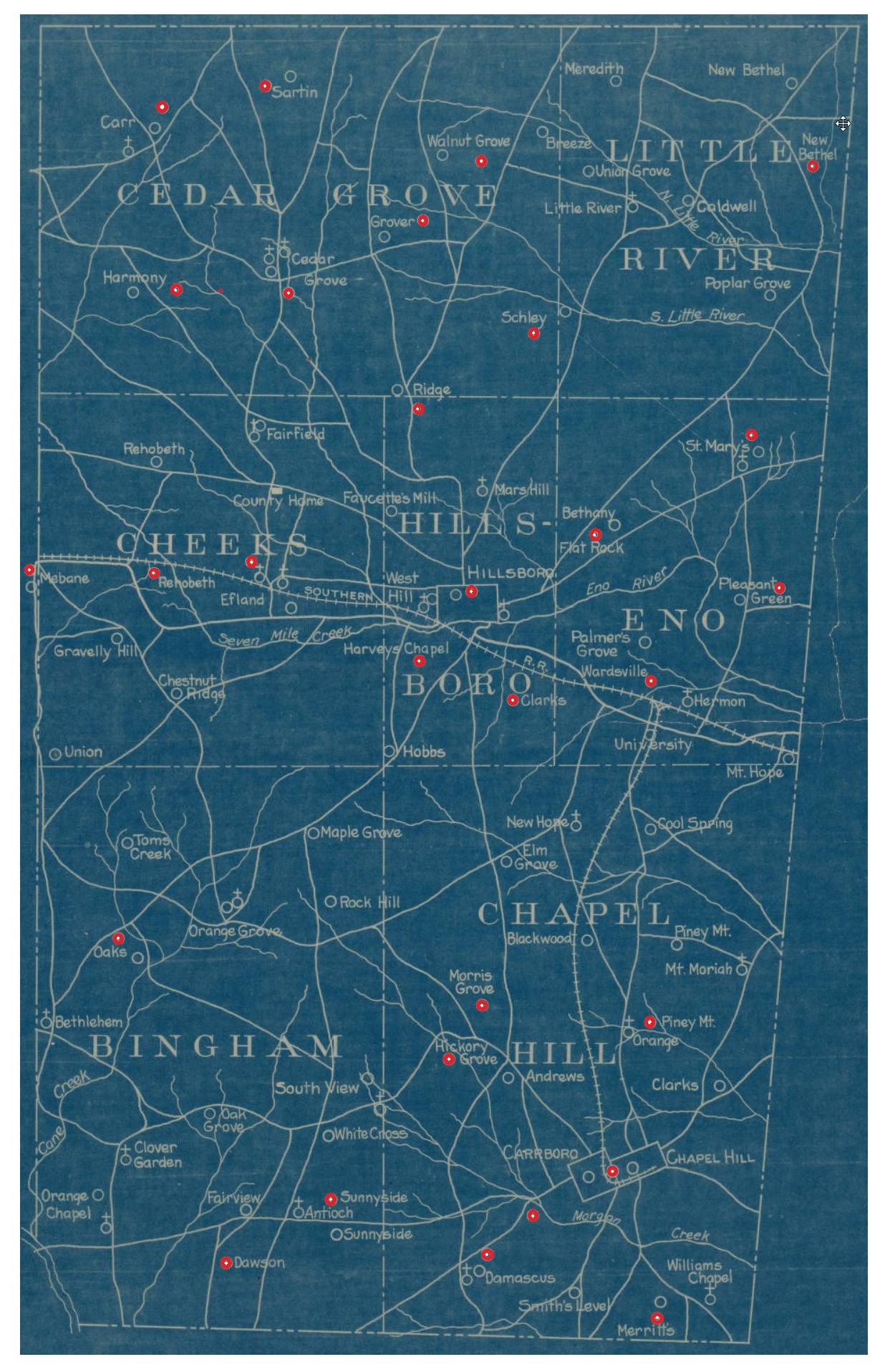
2. We are going to expand this beyond Northside. We’re very curious about areas that had large Black populations and now don’t. One way to potentially think about this is to focus on areas where segregated schools existed. Mark also mapped that out, here. The red dots show segregated Black schools across Orange County.
3. This will take a lot of time, effort, and trips to the Register of Deeds to pour over records. It will also require coders and mappers and data visualizers to help make sense of this data.
4. This is a community-wide project, not an individual one. And it’s not just a data story. It’s a story shaped by data, but contextualized by people who have lived in Chapel Hill and its surrounding areas for decades — and can tell the stories of how these areas changed.
We plan to reach out to people who have been helping us untangle covenant research to see if they’d like to help with this work.
OK, I’m in! What’s next?
Fill out this simple form to let us know you’re interested and how to get in touch with you. We will reply with next steps and instructions.